How to create flexible buttons in Figma

In this blog post, I will show you how to create a flexible button component in Figma. This button component will utilise “Auto Layout” (to resize to fit its content), but it will be created in a way that it can also be resized manually.
Resizing manually can be very useful when you want to match a button to the width of a form field or stretch a button to full screen width on a mobile device.
I will also incorporate left & right icons, which can be turned on/off when needed to cover a vast range of button uses.
STEP 1 - CREATE OR OPEN YOUR DOCUMENT
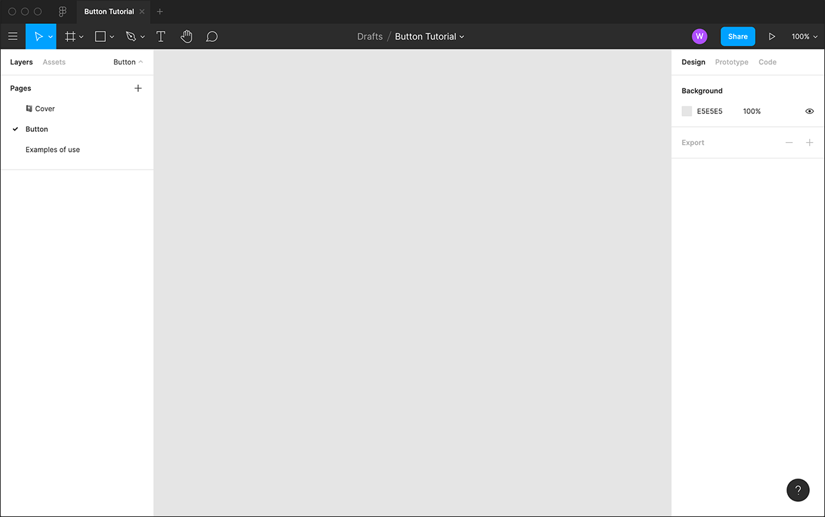
Open up Figma & create a new draft document, or open up an existing document in which you want to create your button.
In my example, I have created a simple file just for the purpose of this tutorial.
STEP 2 - DRAW OUT BUTTON & ADD TEXT
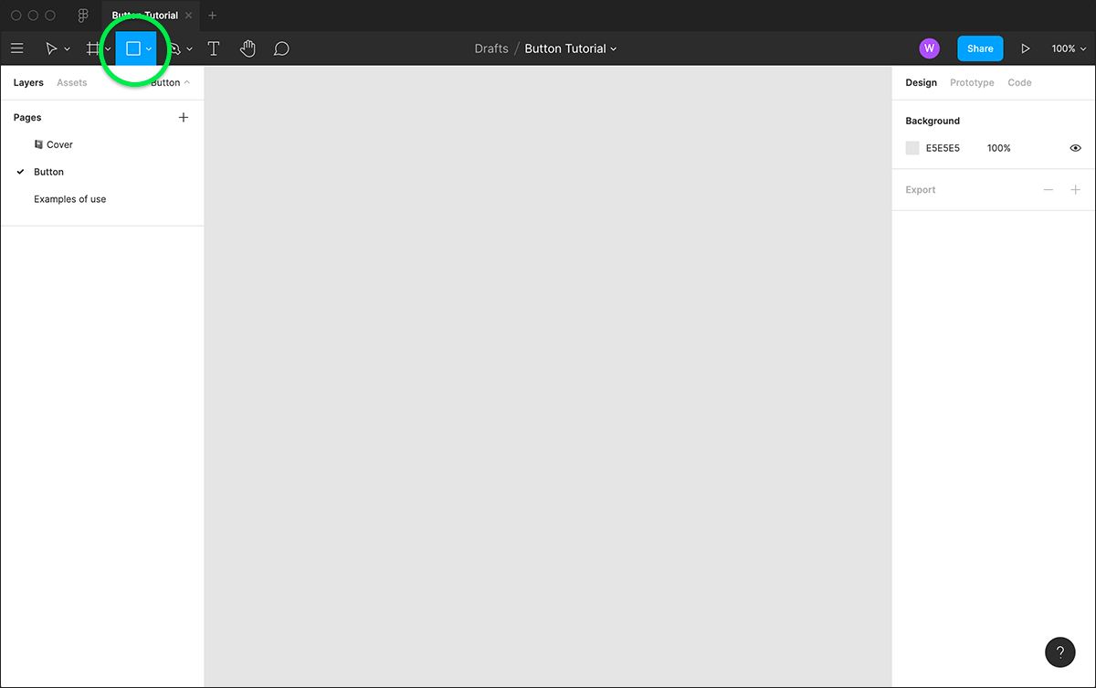
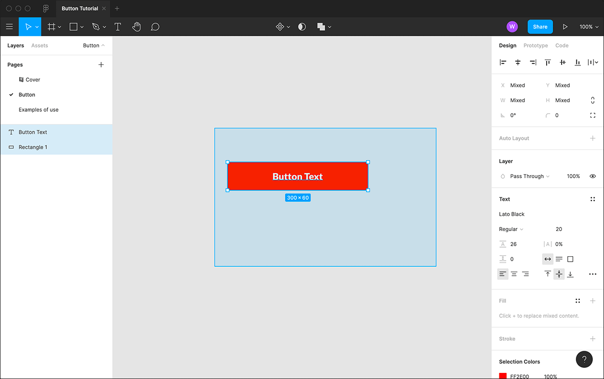
Select the rectangle tool from the top menu and draw out your button shape on the canvas. The dimensions don’t matter too much at the stage, as we can adjust them later.
Next, select the text tool, click onto the rectangle & type out your “Button Text”. I have kept my text left aligned, but dragged my text layer to the centre of the rectangle. You can change your colours or text style now if you like, or you can easily change this later.
I have opted for a bright orange button, with white text.
STEP 3 - ADD AUTO LAYOUT
Now, click and drag to select your rectangle & text. With both items selected, click on the plus icon next to “Auto Layout” (in the right hand column) to create your Auto Layout frame (You can also use the shortcut “Shift + A”).
Now we have our auto layout frame "Frame 1", let's change the horizontal padding to see how it works. I have set my padding to 40, and you can see it has changed the button's width.
STEP 4 -INTRODUCE ICONS

I have now imported some example Font Awesome icons onto the canvas, using the plugin “Iconify”. You can import or paste in different icons if you prefer, or create your own using figma's shape tools. Once imported or created, make each one a component by selecting them and clicking on the “create component” button in the top menu.
Now we are going to add them into our button frame. Select one of your icons, copy it (cmd + c), then select the layer “Button text” in “Fame 1”. Now paste in your icon (cmd + v).
Next align it vertically inside the frame, using the vertical align button at the top of the right sidebar. You can also change the colour now if you prefer. I have changed my icon to white.
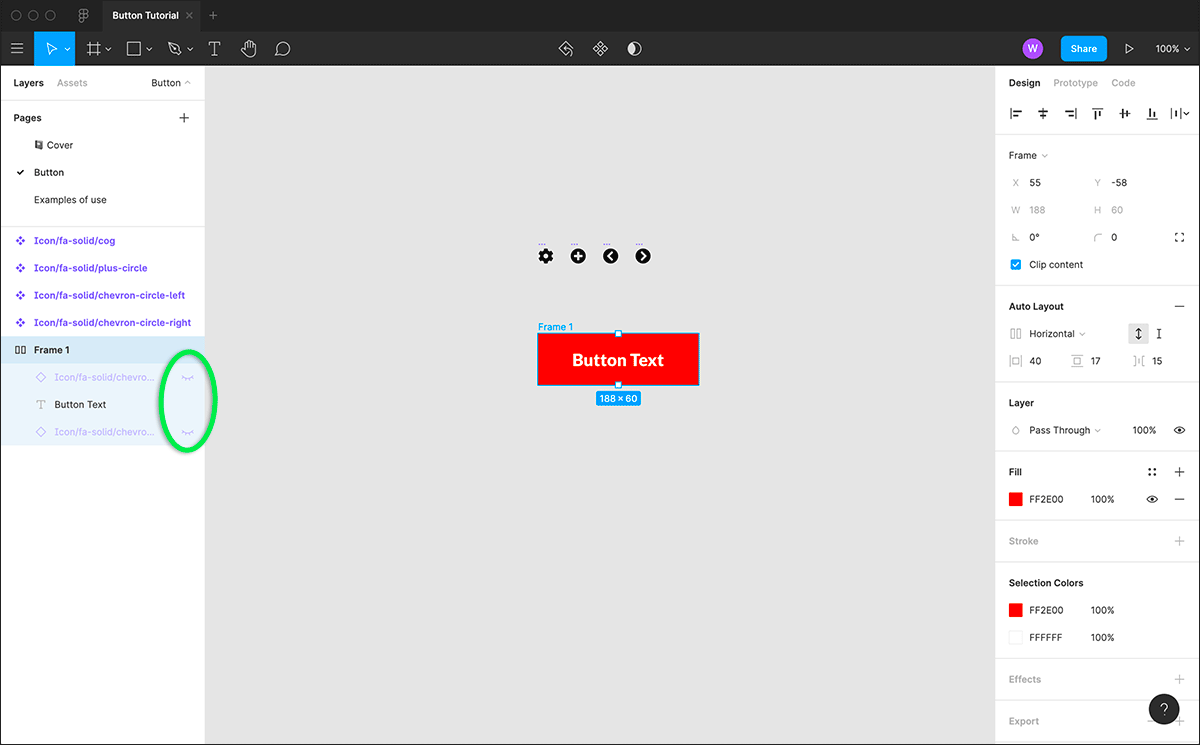
Now we have one icon on the right, I will add in another one on the left. This could potentially be used for something like a back button. Select & copy the icon we have already created, then paste in a copy.
You will see two of the same icons equally spaced, but we want to change the icon components instance in the right-hand sidebar. I have selected the left chevron circle from the drop down list, then aligned and changed the colour to match. Now, in the left hand side bar, move your new icon below the button text (this will move your icon to the left side of the button.
We now have a left icon, button text and a right icon. You can adjust the spacing between these elements as you see fit in the auto layout settings with “Frame 1” selected.
STEP 5 -CREATE COMPONENT
We are going to turn off our icons (the idea being that we turn these back on as & when we need them). Click on the eye icons in the left panel to turn these off.
Now we are going to turn our auto layout frame (Frame 1) into a component. Click on the component icon in the middle of the top tool bar. I have renamed this "button_structure". This is the auto layout element of our button and it will sit inside another component, which is what allows us to make it fixed width when required.
Copy & paste our new "buttonstructure" component so we have 2 (main component & an instance), we need to do this as you can't have a main component inside another main component. With our new copied instance of "buttonstructure" selected, click the component icon in the top tool bar once again. This will place the instance of "button_structure" inside a new component. I have renamed this new component simply "button".
STEP 6 - MAKE ADJUSTMENTS
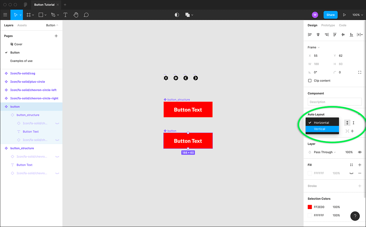
Now, inside our "button" component, select the instance of "button_structure" and remove the coloured fill. We then apply a fill to our main button component instead.
Selecting "button" once again, go to the right-hand panel auto layout settings & change horizontal, to vertical. This will keep the width of our "button" component to match its contents.
It is import to note, we should keep these main components separate in our figma file & only edit them to apply changes to other instances.
STEP 7 - TEST
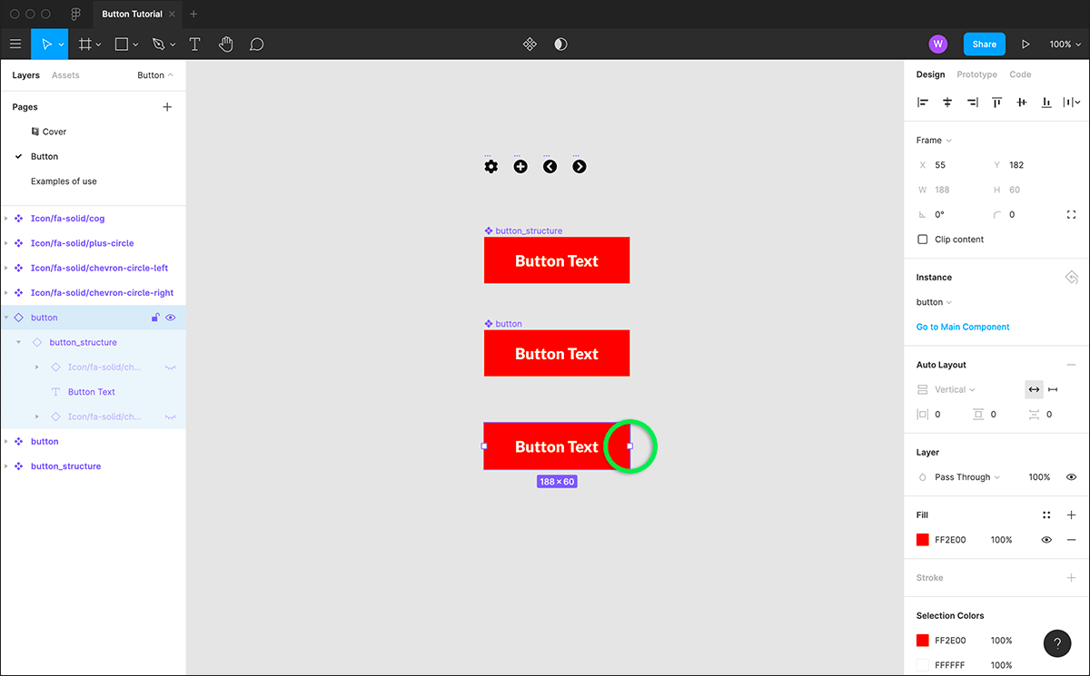
We can now test how our button component works. Copy and paste "button" to create a new instance of this component. As I said before, only use the main components to make changes to other instances, do not use them in your page/product designs.
With our new instance selected, you can try manually resizing simply by dragging the with of the button. You can also try turning on/off the icon layers.
We can see how making a change to our main component will affect our new instance. Here I have added rounded corners to the main "button" component and you can see them also appear on the new instance.
I should also point out, once you make your button a fixed width size, you will have to "reset instance" to get the auto resizing functionality back. You can do this by right clicking on your instance of "button" and select "reset instance" from the list of options.
STEP 8 - EXAMPLES
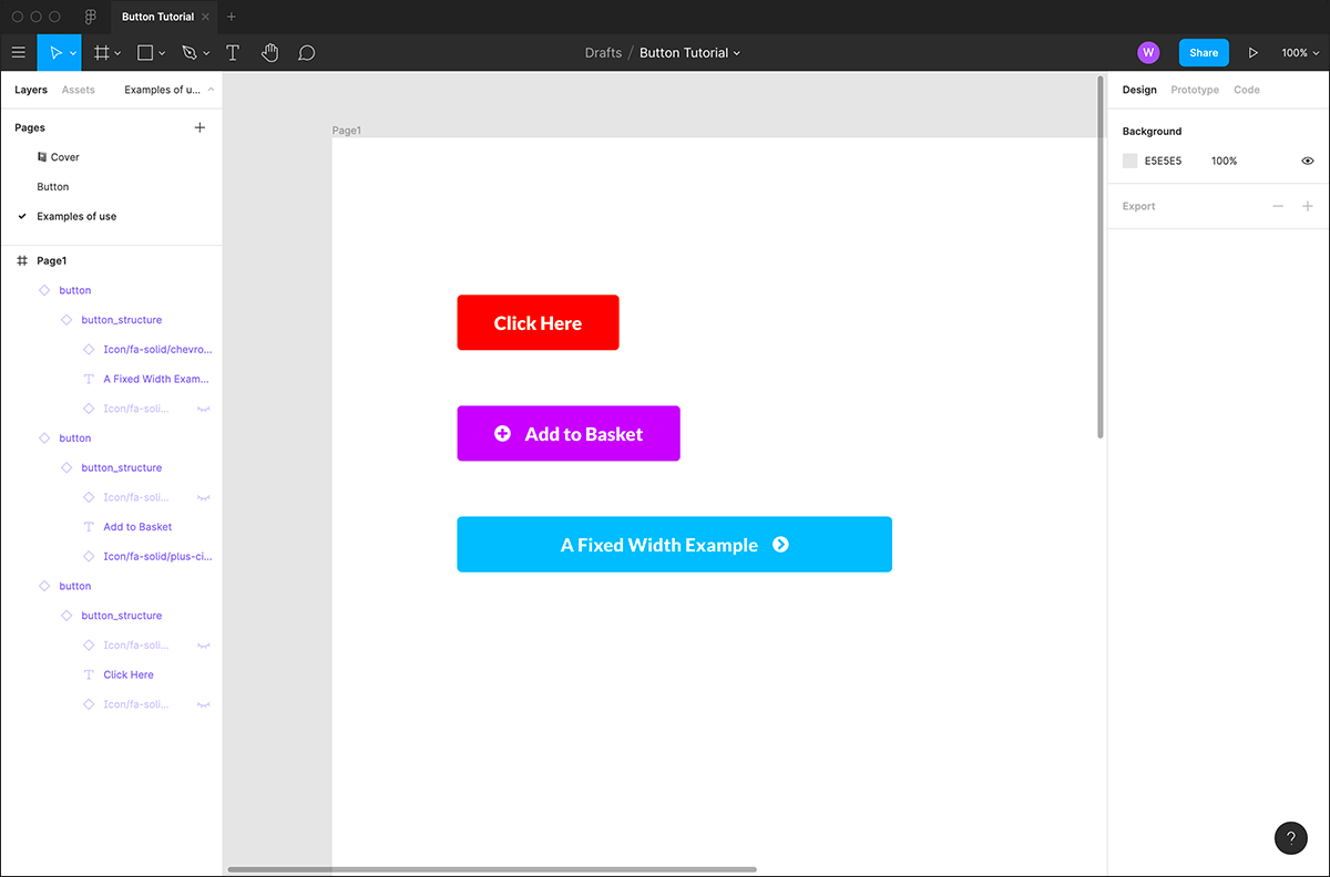
Now we have our finished flexible button, that can be used in various ways but can be still controlled from the original main component. Here are a few quick examples of how the same button component can be used:
A standard button
One with a left icon visible (different instance) and a different colour applied.
A fixed width example, right icon showing and a different colour applied.
You can take this further on your own projects, using a bigger selection of icons for different button, more colours & different states etc.
If you require expert support with your next web project, contact our UX and Design team today.

Creative Director Will has been with Evoluted since 2011. In his role leading the design team, he continues put his extensive experience to use on an impressively-diverse array of websites. Will’s core skills include UX design, creative direction and responsive web design; whilst he’s also earned a renowned reputation as Evoluted’s chief provider of internal, novelty animated gifs.


