Evoluted's a11y Advent Recapped!

Over December we ran an 'a11y Advent' series with daily tips for improving website accessibility and key things to consider when designing website features.
Accessibility is something of a pet topic for our team. Earlier in 2022 we published a comprehensive free Ultimate Guide to UX, packed with tips for making it as easy as possible for visitors to navigate and use your website.
The a11y Advent was the brainchild of our Technical Team Lead Andy Carter, with Andy's tips brought to life by Creative Director Will Barron.
The advent calendar received some brilliant engagement on socials, so we've collated the full series of tips here for ease of reference.
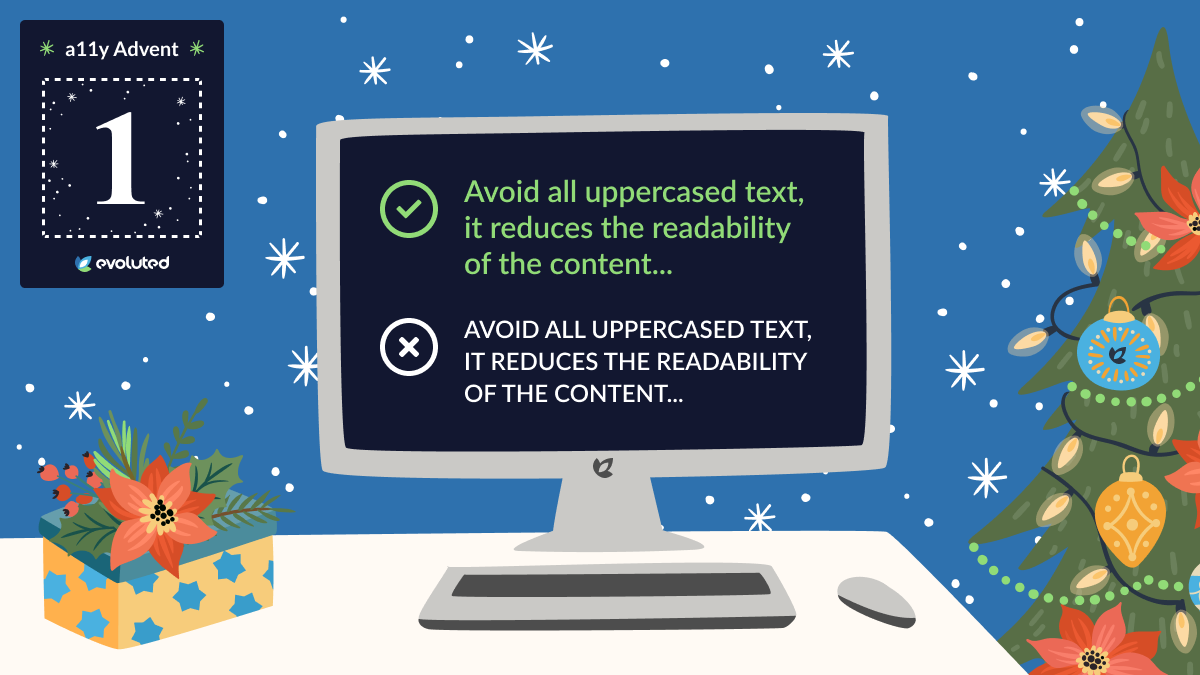
Tip #1: All-uppercased text
Avoid all-uppercased text - it reduces the readability of the content for those with dyslexia and causes issues for screen-readers.
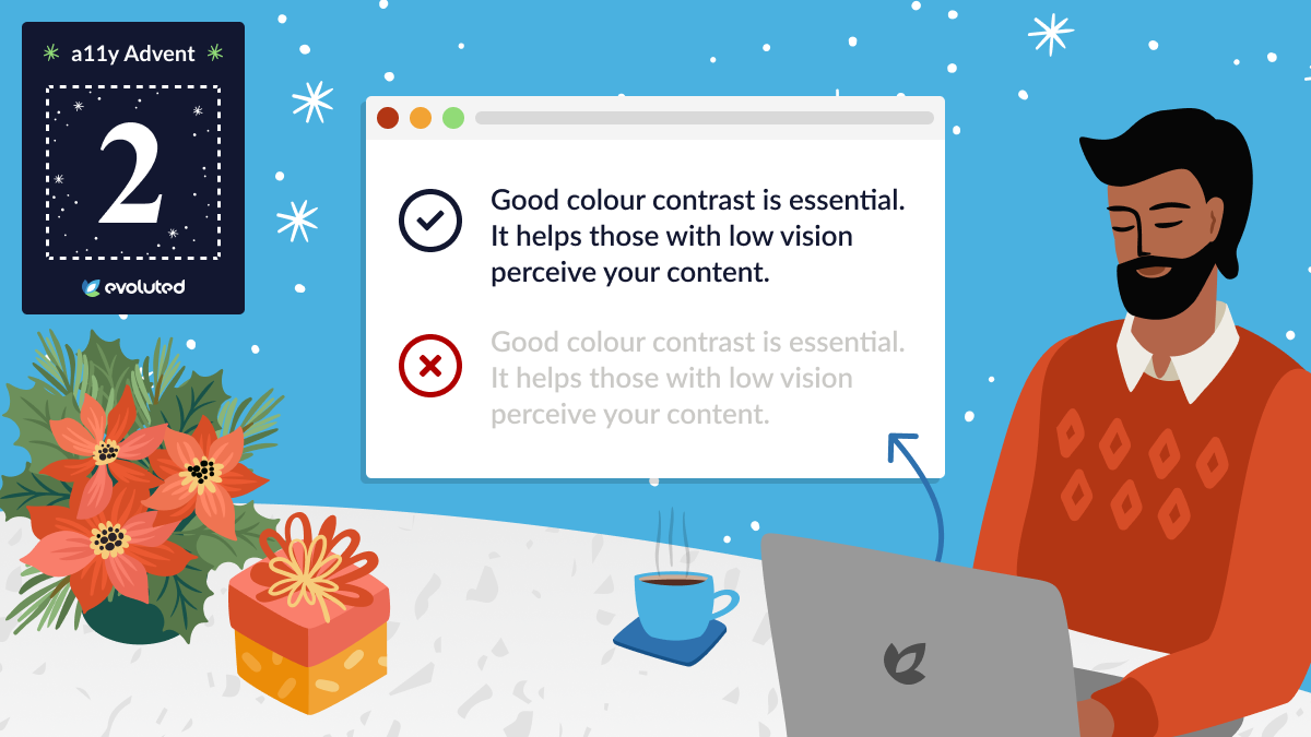
Tip #2: Colour contrast
Good colour contrast is essential - it helps people with low vision perceive your content.
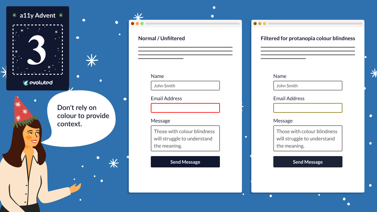
Tip #3: Colour for context
Don't rely on colour to provide context. People with colour blindness will struggle to understand the meaning. 'Red-green' colour vision deficiency affects around 1 in 12 men and 1 in 200 women.
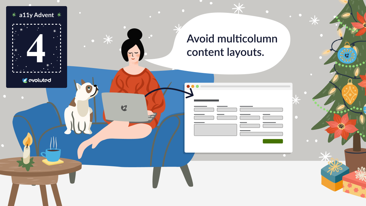
Tip #4: Content layout
Avoid multicolumn content layouts. This helps people with a low field of vision because it means they don't have to horizontally scroll and risk losing their place in the content.
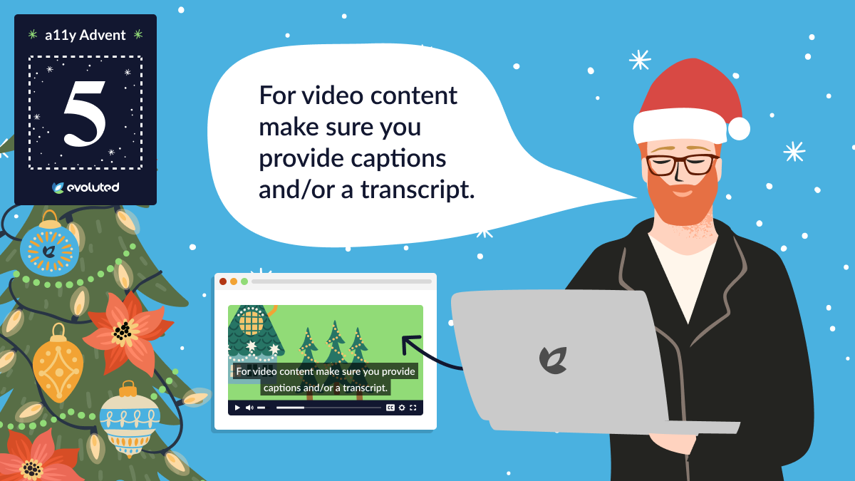
Tip #5: Video content
Make sure you provide captions and/or a transcript for videos - 1 in 6 UK adults are affected by hearing loss, making it the country's second-most common disability.
There are also many other reasons why users may not be able to play your videos with sound - for example, if they're watching in public without headphones.
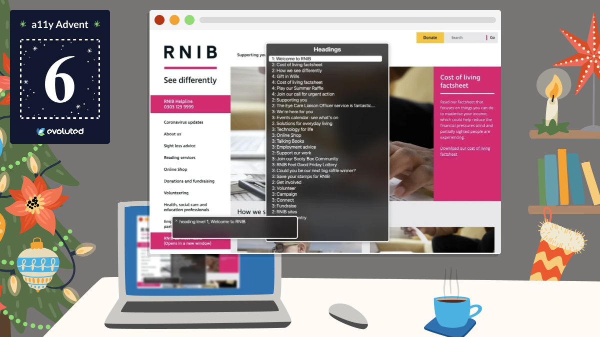
Tip #6: Headings in content
Make sure you use a good heading structure and don't skip heading levels. Your headings should establish the content hierarchy and follow a sequential order.
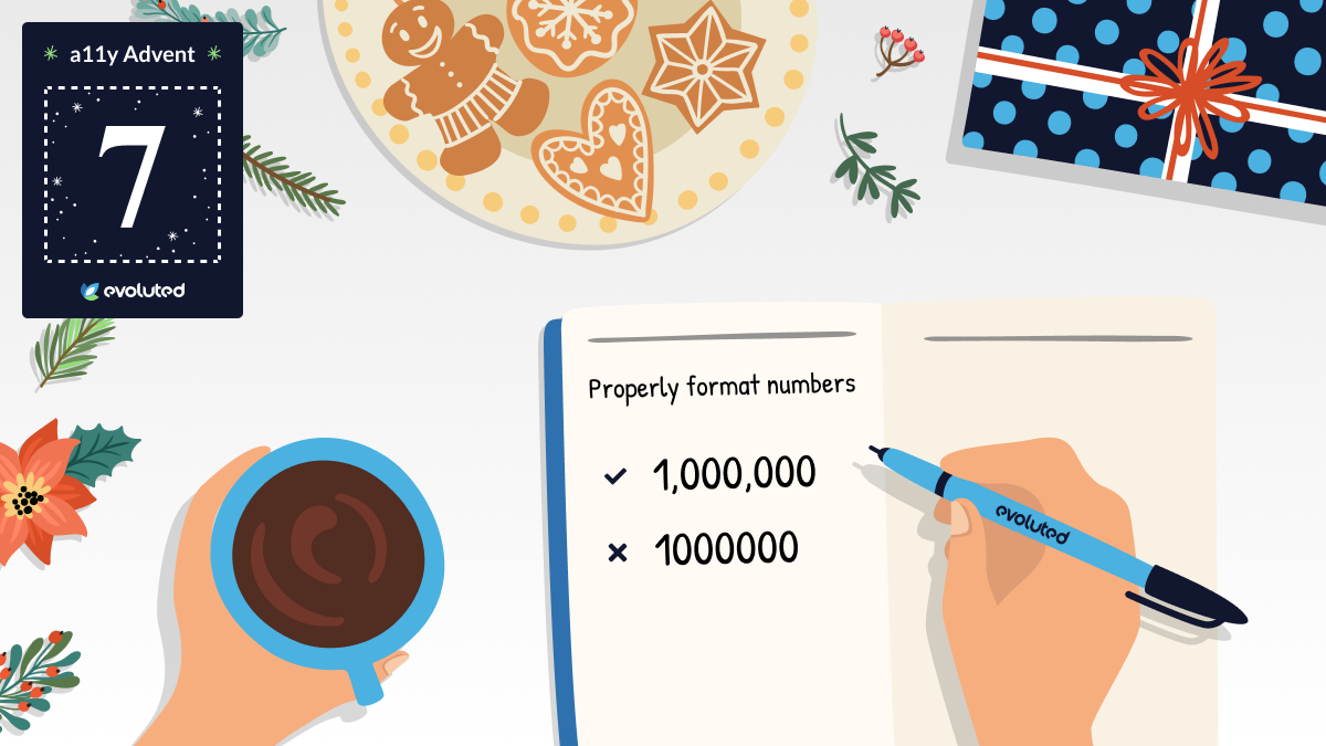
Tip #7: Formatting numbers
Formatting numbers properly makes them easier to read for people with conditions like dyscalculia. Break up large numbers with commas and for credit cards, use spaces after every fourth digit.
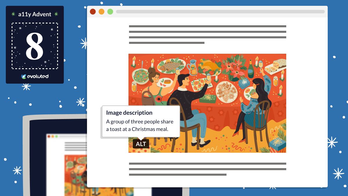
Tip #8: Alt text for non-decorative images
Provide alt text for all non-decorative images so that people using screen-readers can perceive the image's meaning.
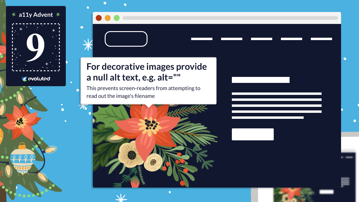
Tip #9: Alt text for decorative images
For purely decorative images, provide a null alt text, i.e. alt="".
This prevents screen-readers from attempting to read out the image's filename.
This tip led to an interesting debate on Twitter about whether to still add alt text for images there - the consensus was that this is a good idea, as Twitter otherwise applies "image" as the default alt text which is unhelpful to users with screen-readers.
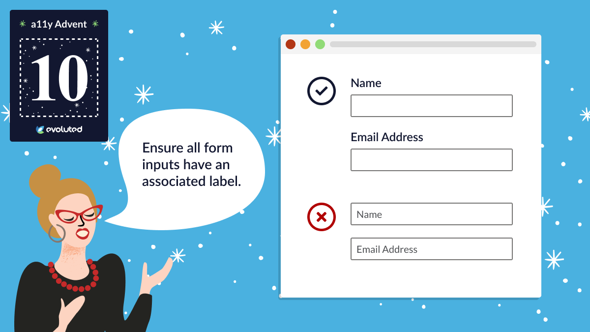
Tip #10: Form inputs
Ensure all form inputs have an associated label - never use the placeholder attribute as the label (or for anything important to completing the form).
Labels help people with dexterity issues, cognitive disabilities and screen-readers.
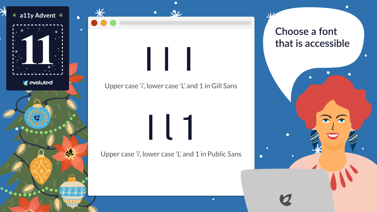
Tip #11: Font choice
Your font choice affects your content's readability for people with disabilities like dyslexia and reduced vision - so use accessible fonts. The Readability Group's "Guide to Understanding What Makes a Typeface Accessible" may be a useful resource here.
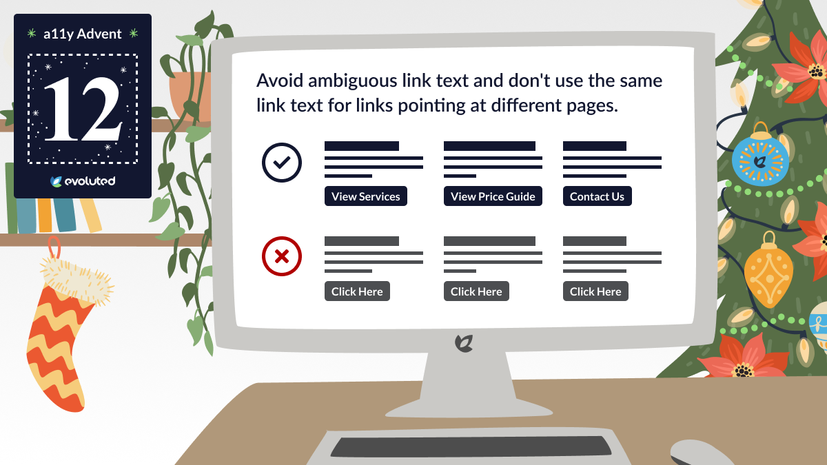
Tip #12: Link text
Avoid ambiguous link text like 'Click here' or 'Read more' - and don't use the same link text for links pointing at different pages.
Some assistive technologies let people browse links in isolation from content, so the link text needs to provide context.
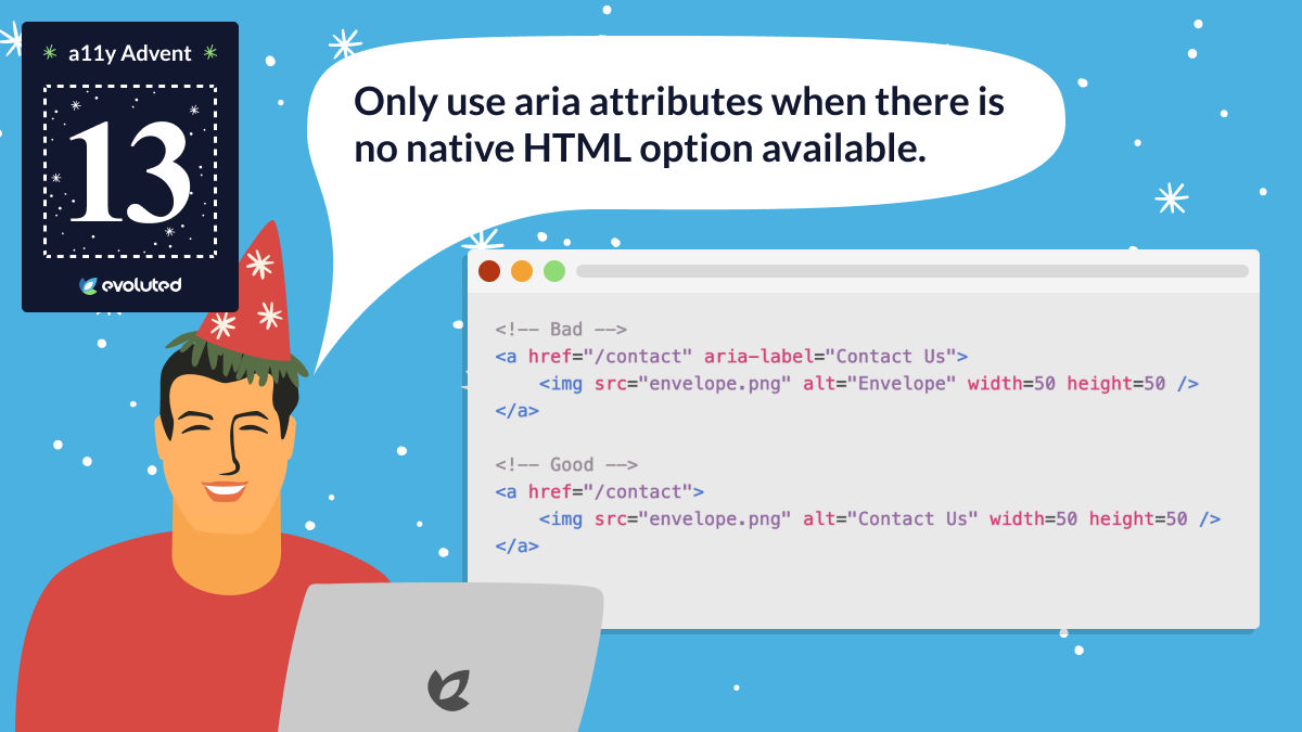
Tip #13: ARIA attributes
Only use ARIA (Accessible Rich Internet Applications) attributes when there's no native HTML option available.
ARIA supplements HTML, but no ARIA is better than bad ARIA. If you can use a native HTML element/attribute that does what you need, do so.
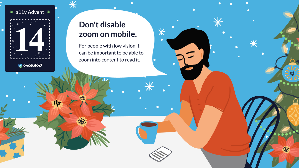
Tip #14: Mobile zoom
Don't disable zoom on mobile - for people with low vision it's important to have the ability to zoom into content to read it more easily.
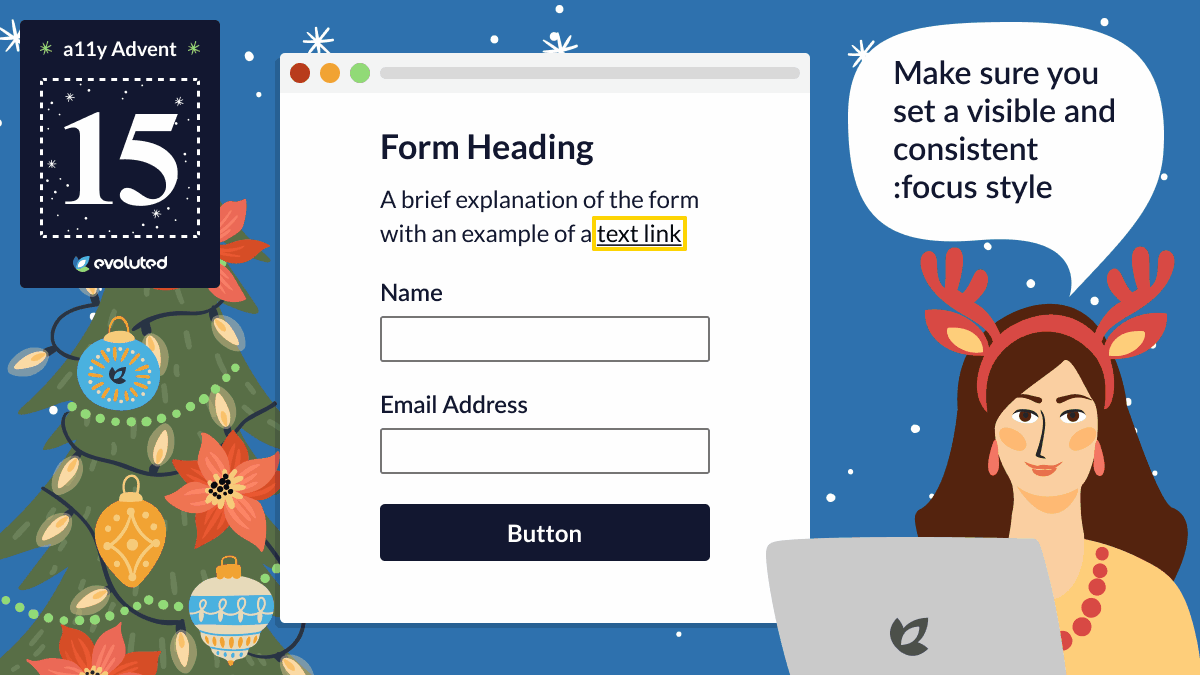
Tip #15: Focusable elements
Make sure you set a visible and consistent :focus style to focusable elements like links and buttons. This ensures content can be easily navigated without a mouse.
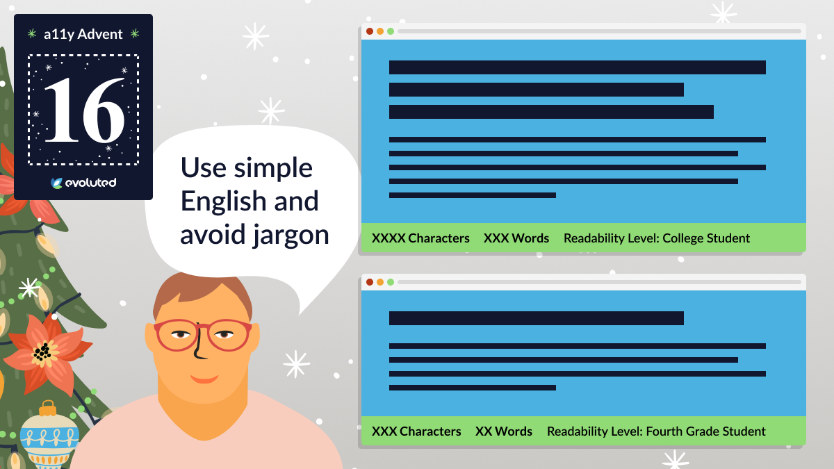
Tip #16: Sentence structure
Use simple English and avoid jargon to ensure your content is accessible to those with cognitive disabilities.
This also helps people without recognised disabilities - 1 in 6 UK adults has the reading level of an 11-year-old.
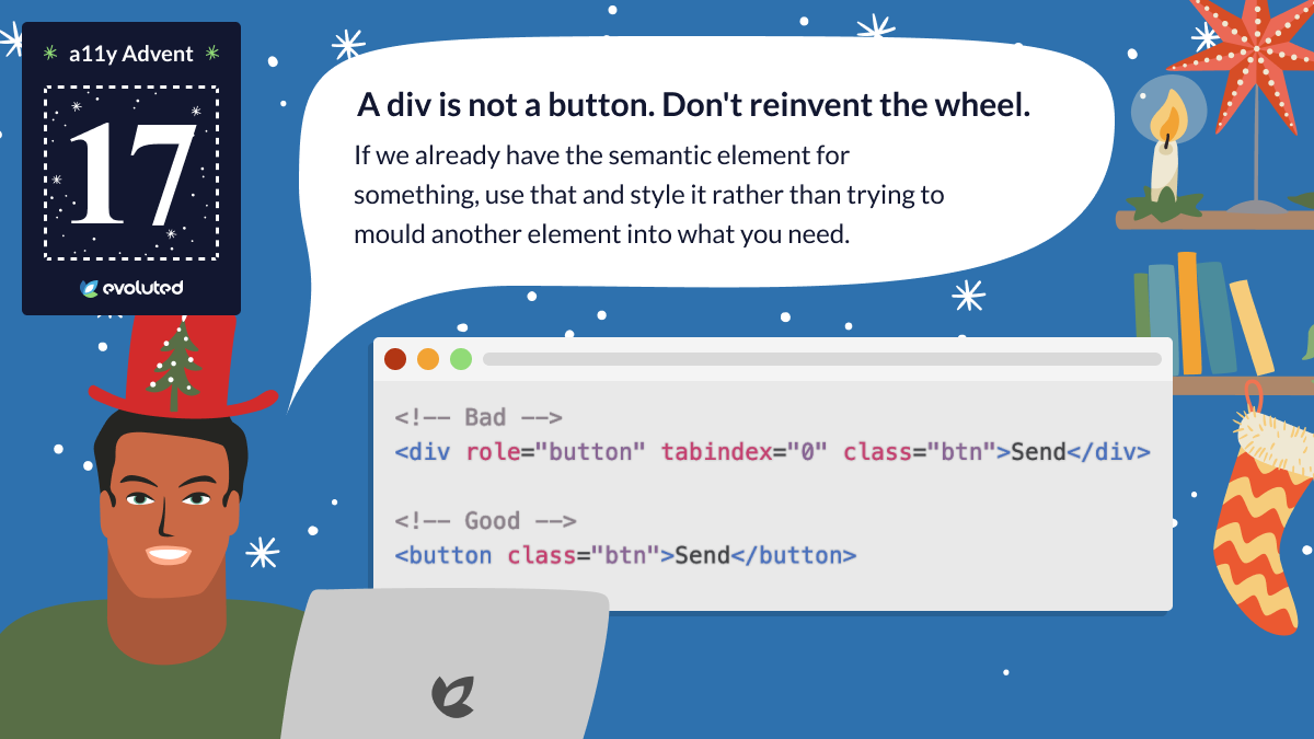
Tip #17: Divs and buttons
A div is not a button. Don't reinvent the wheel - if we already have the semantic element for something, use that and style it, rather than trying to mould another element into what you need.
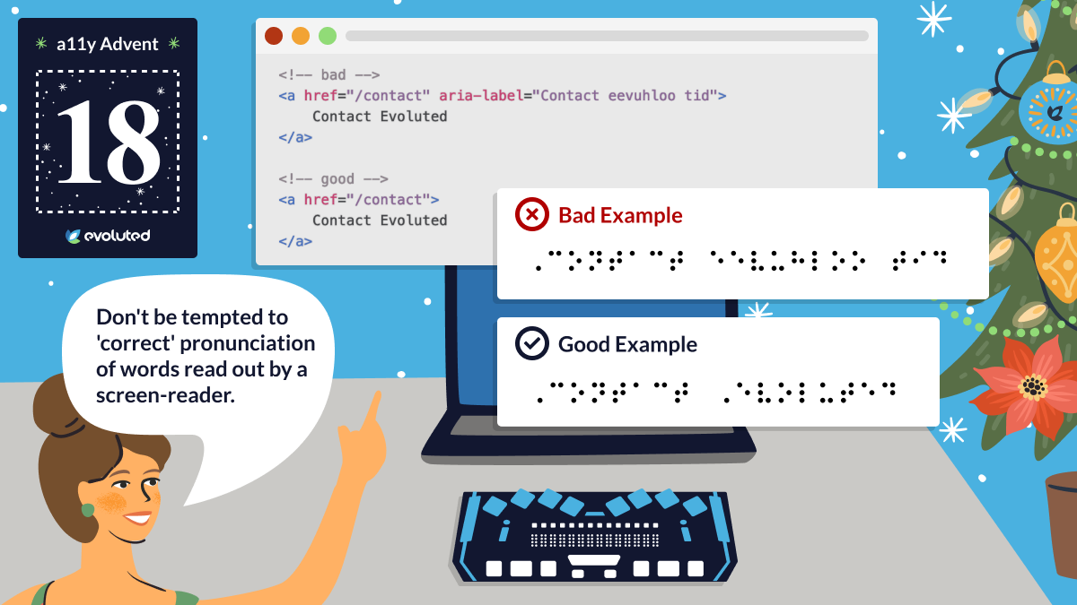
Tip #18: Screen-readers
Don't be tempted to 'correct' pronunciation of words read out by a screen-reader. It will cause confusion for people who use other assistive technologies like a Braille reader.
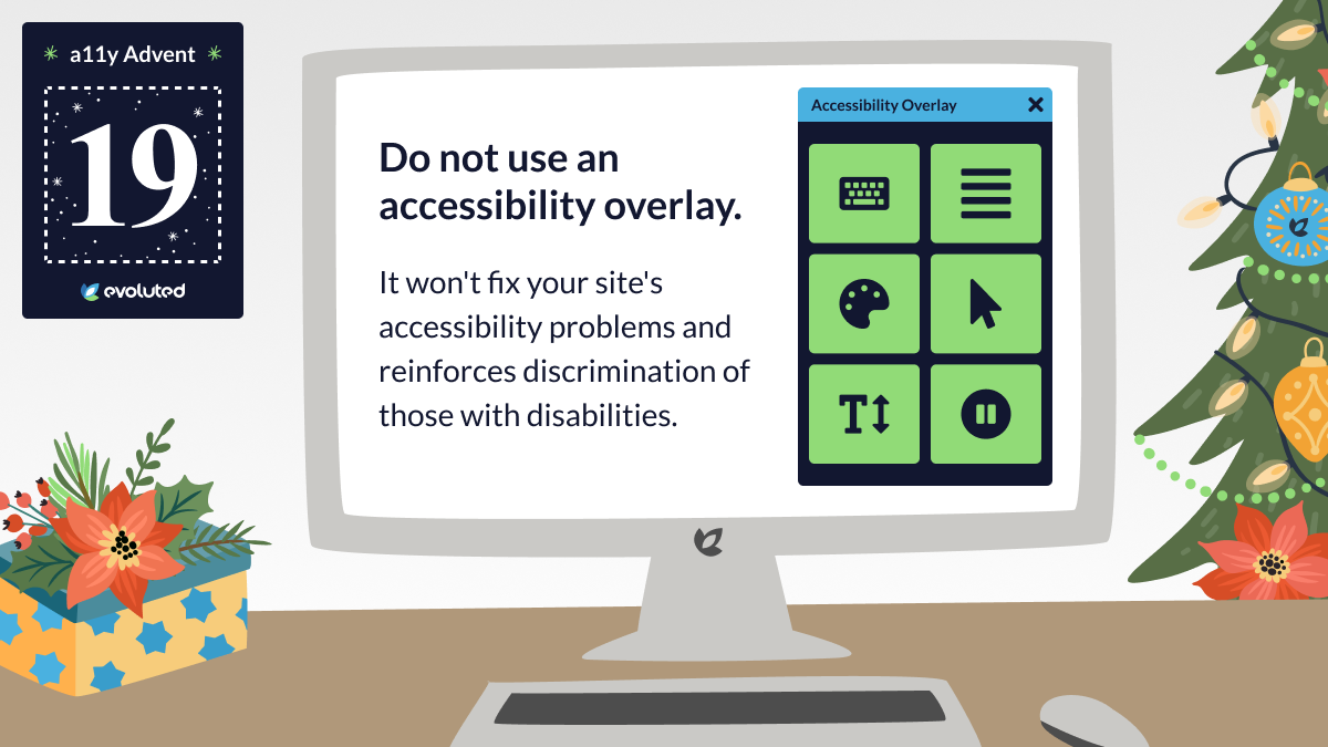
Tip #19: Accessibility overlays
Do not use an accessibility overlay. It won't fix your site's accessibility problems and reinforces discrimination of those with disabilities.
For more information, see Should I Use An Accessibility Overlay?
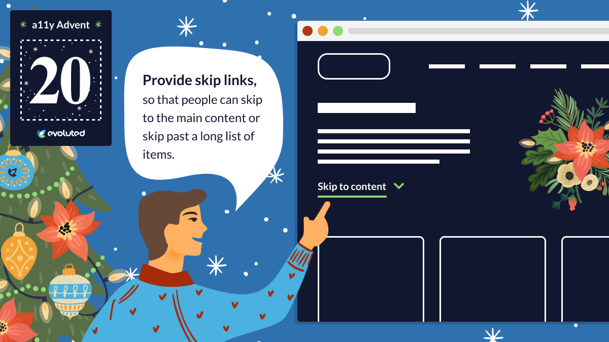
Tip #20: Skip links
Provide skip links to allow people to skip to the main content or skip past a long list of items. This really helps those using a keyboard to navigate the page.
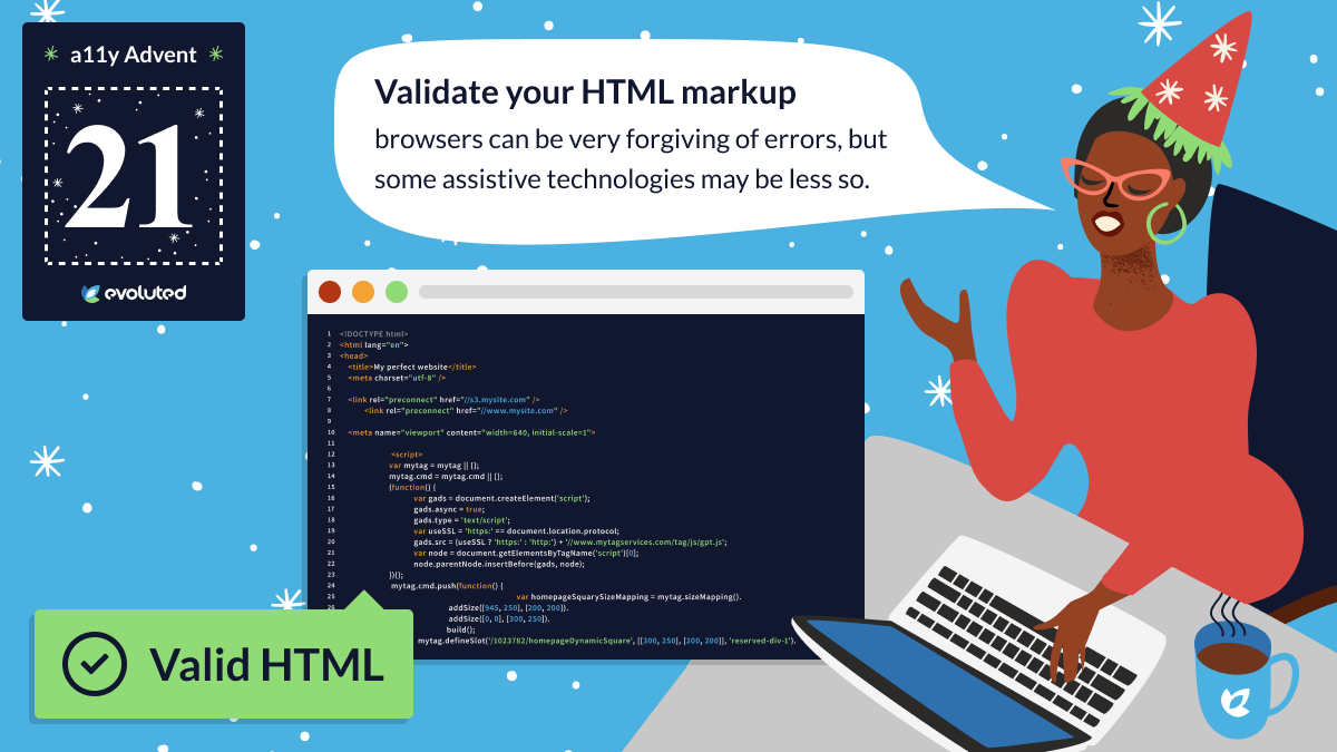
Tip #21: HTML validation
Validate your HTML markup. Browsers can be very forgiving of errors, but some assistive technologies may be less so. The W3C provides a free HTML markup validator.
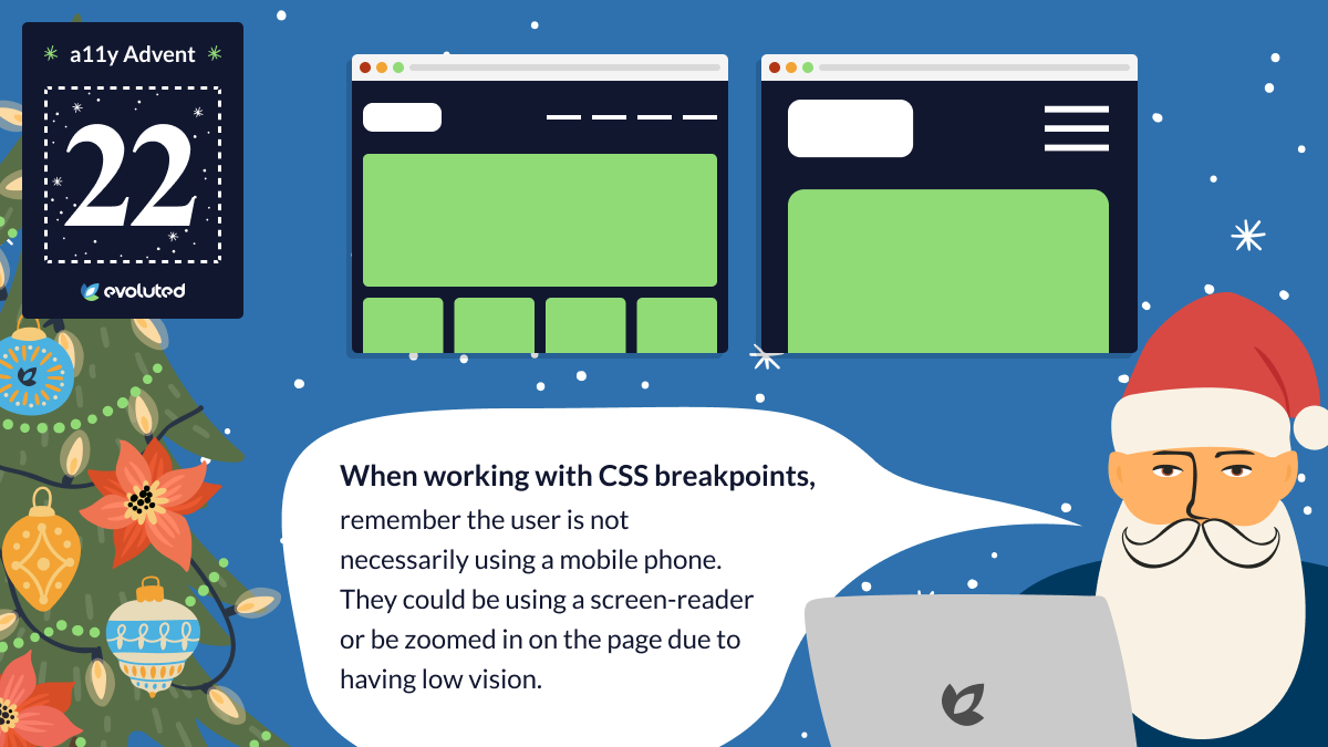
Tip #22: CSS breakpoints
When working with CSS breakpoints, remember the user is not necessarily using a mobile phone. They could be using a screen-reader or be zoomed in on the page due to having low vision.
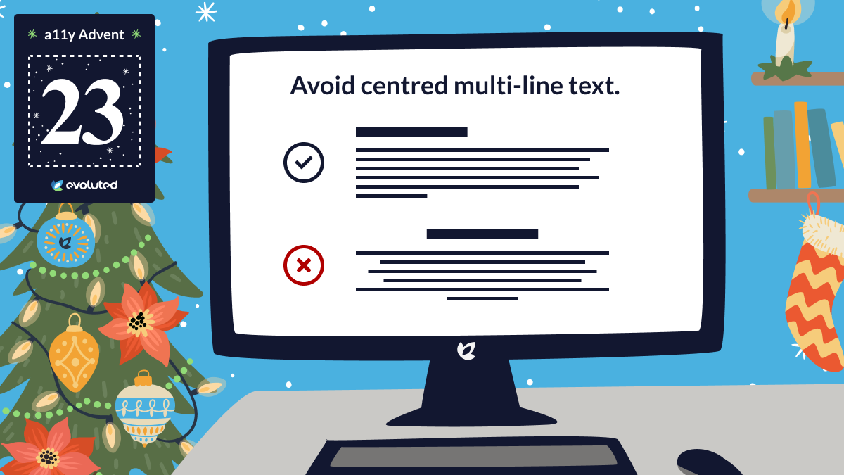
Tip #23: Text layout
Avoid centred multi-line text. This can cause readability issues, particularly for people with dyslexia. Justified text is also problematic.
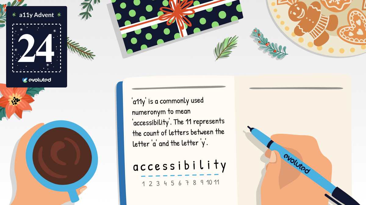
Tip #24: a11y
'a11y' is a commonly used numeronym for 'accessibility' and the source of our series' name. The 11 represents the count of letters between 'a' and 'y' in 'accessibility'.
If you need expert support with your web design and UX, see our Create services or our UX and Accessibility Audits offering.

As our Digital Marketing Manager, Dan spreads the word about the excellent work being delivered by our team, drawing on his background in journalism and SEO.
Having founded an SEO agency for start-up businesses in his previous role, Dan relished the opportunity to join the set-up at Evoluted and help grow an already thriving agency. He was named one of The Drum's Future 50 Emerging Marketers Worldwide for 2023 and was a finalist for Prolific North's 2022 Marketer of the Year.